Official Everybody Edits Forums
Do you think I could just leave this part blank and it'd be okay? We're just going to replace the whole thing with a header image anyway, right?
You are not logged in.
- Topics: Active | Unanswered
#1 Before February 2015
- Fer22f
- Guest
Bricks, smileys, graphics of Fer22f!
Are I go!
The new pack:
With:
Blue coindoor closed (now blue)
Blue coindoor open
New years 2010 white light
Last edited by Fer22f (Jan 16 2011 12:30:39 pm)
#2 Before February 2015
- Jeffrey
- Guest
Re: Bricks, smileys, graphics of Fer22f!
im like this ![]()
#3 Before February 2015
- BillyP
- Guest
Re: Bricks, smileys, graphics of Fer22f!
These are good ![]()
#4 Before February 2015
- Fer22f
- Guest
Re: Bricks, smileys, graphics of Fer22f!
I only used mspaint and image of blue coin and coindoor.. lol! I'm not good, but I try to make things... More things soon!
And thanks for coments, ![]()
#5 Before February 2015
- Cola1
- Member

- From: We will meet again as stars
- Joined: 2015-02-15
- Posts: 3,281
Offline
#6 Before February 2015
- Fer22f
- Guest
Re: Bricks, smileys, graphics of Fer22f!
lol nice. but i think the blue coin door should have a blue block :3
I think it too. I will make this.
Last edited by Fer22f (Jan 16 2011 11:39:47 am)
#7 Before February 2015
- Jeffrey
- Guest
Re: Bricks, smileys, graphics of Fer22f!
the blue coin needs to be bigger in that block ![]() but nice!
but nice!
#8 Before February 2015
- Fer22f
- Guest
Re: Bricks, smileys, graphics of Fer22f!
the blue coin needs to be bigger in that block
but nice!
Lol, the effects of the transformation make this more "small", it is normal size.
#9 Before February 2015
- BillyP
- Guest
Re: Bricks, smileys, graphics of Fer22f!
Liking the blue coin door, however it's quite hard to see the coin in the middle, I suggest you draw a white border around the coin and see how that looks ![]()
#10 Before February 2015
- Fer22f
- Guest
Re: Bricks, smileys, graphics of Fer22f!
Liking the blue coin door, however it's quite hard to see the coin in the middle, I suggest you draw a white border around the coin and see how that looks
OK, I will draw!
EDIT: But that's looks horrible! I have to make a blue more clearer on block..
Last edited by Fer22f (Jan 16 2011 1:51:28 pm)
#11 Before February 2015
- BillyP
- Guest
Re: Bricks, smileys, graphics of Fer22f!
OK, I will draw!
EDIT: But that's looks horrible! I have to make a blue more clearer on block..
Okay, it's up to you what you do, but I think making the blue coin clearer would be a good start ![]()
It looks good already, though!
#12 Before February 2015
- SmittyW
- Member

- Joined: 2015-03-13
- Posts: 2,085
Re: Bricks, smileys, graphics of Fer22f!
Just to help make it better, you should make the blue coin clearer and a bit bigger. You should also make the left side of the block same color lighting as the center, just so it doesn't seem like an indent in the middle. Also, have the block itself be a different kind of blue so it doesn't blend with the coin as much, you know what I'm saying? ![]()
Offline
#13 Before February 2015
- an
- Guest
Re: Bricks, smileys, graphics of Fer22f!
I only used mspaint and image of blue coin and coindoor.. lol! I'm not good, but I try to make things... More things soon!
And thanks for coments,
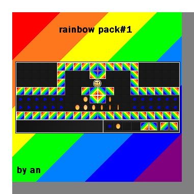
i use ms paint too and i made this
#14 Before February 2015
- Doghana
- Guest
Re: Bricks, smileys, graphics of Fer22f!
yea, i too especially like the blue coin door. nice job. i also tried some of my own stuff, im not good but i'm giving it a go ![]() (i'd like to hear everyones feedback about my bricks)
(i'd like to hear everyones feedback about my bricks)
#15 Before February 2015
- Gamer36
- Guest
Re: Bricks, smileys, graphics of Fer22f!
Cool, so many new ideas, great material for professionals like me and Cola1 to start working on.
#16 Before February 2015
- nax
- Guest
Re: Bricks, smileys, graphics of Fer22f!
:/
#17 Before February 2015
- steelviper77
- Guest
Re: Bricks, smileys, graphics of Fer22f!
I think they are superawesome! but there needs to be more
#18 Before February 2015
- chan324
- Guest
Re: Bricks, smileys, graphics of Fer22f!
COOOOOOOOOOOOOOOOOOOOOL!

#19 Before February 2015
- Different55
- Forum Admin

- Joined: 2015-02-07
- Posts: 16,575
Re: Bricks, smileys, graphics of Fer22f!
I like the white light.
"Sometimes failing a leap of faith is better than inching forward"
- ShinsukeIto
Offline
#20 Before February 2015
- Chessehunta
- Guest
Re: Bricks, smileys, graphics of Fer22f!
I want the blue coin door, New year whitelight please.
Last edited by Chessehunta (Feb 5 2011 7:19:30 pm)
#21 Before February 2015
- Sonic
- Guest
Re: Bricks, smileys, graphics of Fer22f!
Blue coin door could use some more definite lines around the coin.
Other than that, looks good. :O
#22 Before February 2015
- supersonic50
- Guest
Re: Bricks, smileys, graphics of Fer22f!
![]()
can i have?
#23 Before February 2015
- Monstar43
- Guest
Re: Bricks, smileys, graphics of Fer22f!
Don't gravedig supersonic50.It could get you banned.
#24 Before February 2015
- labontandrei
- Guest
Re: Bricks, smileys, graphics of Fer22f!
cool:)
#25 Before February 2015
- alexrules
- Guest
Re: Bricks, smileys, graphics of Fer22f!
when do these come out, I never seen these
[ Started around 1732748142.5385 - Generated in 0.064 seconds, 12 queries executed - Memory usage: 1.57 MiB (Peak: 1.76 MiB) ]

