Official Everybody Edits Forums
Do you think I could just leave this part blank and it'd be okay? We're just going to replace the whole thing with a header image anyway, right?
You are not logged in.
- Topics: Active | Unanswered
Pages: 1
#1 Before February 2015
- Lopoi2
- Guest
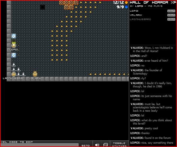
Hall of Horror XP
Hall of horror
Hall of horror
The first room of your end Beta
One screen for Everybody:
100% Tested
Now improved by the new colors.
BEE coments:
115. As I said before, it reminds me of beauty and the beast! Haha. It looks great, perspective is great and I love the window reflection on the floor. A few things. I mentioned before about that torch chilling there. I didnt know it was supposed to be on the floor, so a shadow would have helped. Also, the stairs look wonderful, but take into account the perspective. Even if you are looking straight on, your stairs will seem to get smaller as they get closer to your vanishing point. Looks great though. Those bricks mustve taken forever.
Special thanks to:
Fer22f
Riok
Jincookie
Lucas Melo (This don't play but helped a little)
And of course for all the crew:
Correiajoão
Redshade22
Nikk
Lopoi (me)
Last edited by Lopoi2 (Nov 9 2011 7:07:14 am)
#2 Before February 2015
- Lopoi2
- Guest
Re: Hall of Horror XP
I'm not going to delete this. So, BUMP!
#3 Before February 2015
- Yankeestar180
- Guest
Re: Hall of Horror XP
Scoring for HALL OF HOROR XP
ART
Staircase: 7/10 Looks kind of mushed together at the top, Good attempt at it though.
Walls: 9/10 Great job on these. You shaded the colors in well, and made the slant good. Great Job.
Paintings Middle: 7/10 The middle needs more detail, while the left needs some work.
Right Paintings: 8/10 Great job on the leftmost one, the bat one looks empty, but the castle one is good.
Doors: 7/10 They just need more shading, I recommend one more color in there.
Window: 8/10 Good Light on the floor. And the window just needs to lose the white streak. Looks awkward.
Small Paintings: 7/10 Try to avoid using black blocks for the eyes. Use Red keys or summer, blending it in better.
Overall: 7.5 Keep up the improvements!
MINIS
First Impression Mini: 6/10 The mini was good, but the secret blocks just ruined it.
Walls: 7/10 Very hard to see, but you made use of a colored space. It was good, but not for my eyes. And too easy to fall down.
Im tired now, ill update the rest soon.
EDIT:300th post ![]()
Last edited by Yankeestar180 (Nov 5 2011 9:45:11 am)
#4 Before February 2015
- correiajoao
- Guest
Re: Hall of Horror XP
Thanks for your feedback! We go to re-update it!
#5 Before February 2015
- redshade22
- Guest
Re: Hall of Horror XP
uhmm yeah good review
#6 Before February 2015
- Lopoi2
- Guest
Re: Hall of Horror XP
Update with:
BEE coments:
115. As I said before, it reminds me of beauty and the beast! Haha. It looks great, perspective is great and I love the window reflection on the floor. A few things. I mentioned before about that torch chilling there. I didnt know it was supposed to be on the floor, so a shadow would have helped. Also, the stairs look wonderful, but take into account the perspective. Even if you are looking straight on, your stairs will seem to get smaller as they get closer to your vanishing point. Looks great though. Those bricks mustve taken forever.
#7 Before February 2015
- Jeremiah
- Guest
Re: Hall of Horror XP
1. Cool map! 2. Like the name 3. You did awesome!
#8 Before February 2015
- Lopoi2
- Guest
Re: Hall of Horror XP
Thanks for the coment
#9 Before February 2015
- Lopoi2
- Guest
Re: Hall of Horror XP
Bump.
#10 Before February 2015
- Valarik
- Guest
Re: Hall of Horror XP
I thought this was a great room! The minis were challenging, yet not rage-quitty. 
#11 Before February 2015
- Lopoi2
- Guest
Re: Hall of Horror XP
Thanks it was my aim to make not ragequite games, nor easy games.
#12 Before February 2015
- Lopoi2
- Guest
Re: Hall of Horror XP
Bump I can do it
Pages: 1
[ Started around 1739384295.295 - Generated in 0.056 seconds, 12 queries executed - Memory usage: 1.44 MiB (Peak: 1.55 MiB) ]