Official Everybody Edits Forums
Do you think I could just leave this part blank and it'd be okay? We're just going to replace the whole thing with a header image anyway, right?
You are not logged in.
- Topics: Active | Unanswered
#126 Before February 2015
- XxAtillaxX
- Member

- Joined: 2015-11-28
- Posts: 4,202
Re: EEForumify Theme
What "obvious changes" are you talking about? This is the first I've heard of anything like that. What I'm irritated about is that you approve a plan (Kentiya's), then later call it stupid and say that it's worse than what you had before after I put a lot of work into it. No idea what you're talking about, but I'm not irritated by anything that happened while coding.
The obvious changes regarding the navbar not having an ugly blue button background.
I'm not the person that summoned you nor am I responsible for your own mistakes.
Please stop acting like a child, a mature person would realise that they didn't notice the navbar buttons had been modified and fixed it instead of complaining.

*u stinky*
Offline
#127 Before February 2015
- Different55
- Forum Admin

- Joined: 2015-02-07
- Posts: 16,575
Re: EEForumify Theme
I assumed you just couldn't figure out how to get the background. After all, when Meredith enlisted me, she said you were having trouble.
I'm not asking you to be responsible for my mistakes. Where did you even get that idea? I admitted my mistakes in the last post and took responsibility for them. I fixed my mistakes.
I'm asking you (the web admins) to not ask me to do something, then insult me by telling me it looks worse than before, when I have followed the only instructions I received. That's a completely reasonable request, and it's not childish to react negatively to have the work that you (the web admins) requested, and that I put effort into, be insulted. That's all I'm irritated about, as I've said at least three times now. I can change the blue, but don't insult me for doing exactly what you (the web admins) told me to do. That is all I'm asking. That's it. No other events have contributed to my mood. Just the verbal/textual punch in the face you gave me after I finally decided that it was okay to release
I'll change the blue when I get home in 6 hours, or before then if I get the chance. Like I said, I didn't know you had purposefully not added it. I've admitted that, and I'm not complaining about that. I'm complaining about the words you used that seem to have no other point than to bash me for carrying out the instructions I was given, as I said in the last paragraph and the last several posts.
Last edited by Different55 (May 13 2014 8:55:56 am)
"Sometimes failing a leap of faith is better than inching forward"
- ShinsukeIto
Offline
#128 Before February 2015
- XxAtillaxX
- Member

- Joined: 2015-11-28
- Posts: 4,202
Re: EEForumify Theme
I've only said it looked better beforehand. I don't see how that's an insult, it's an honest opinion.
I specified what I think should be reverted, everything else is/was fine.
I don't know what instructions you were given, I didn't specify anything of the sort.
I'm not responsible for knowing what you were working on when you didn't show any previews.

*u stinky*
Offline
#129 Before February 2015
- Different55
- Forum Admin

- Joined: 2015-02-07
- Posts: 16,575
Re: EEForumify Theme
I've only said it looked better beforehand. I don't see how that's an insult, it's an honest opinion.
Saying it was better before is the same as saying that what I did looks worse than before. How am I not supposed to be insulted when you say something like that? I was asked to copy down an image that you said "looks great", and when I get done, I'm told that it looks worse than what it was. Which I find insulting, considering what the old header looked like.
Saying something's an honest opinion doesn't mean much. If I held an opinion that my sister was an annoying twerp who is incapable of doing anything right, and I tell her so, it doesn't soften the blow at all if I prepend "In my honest opinion, ". You see what I'm saying?
I specified what I think should be reverted, everything else is/was fine.
Then was that one thing all it took to take it from at least acceptable to "The previous version was better"?
I don't know what instructions you were given, I didn't specify anything of the sort.
I told you what instructions I was given a few posts back. And you didn't specify anything. I'm not sure what the second half of the sentence is doing here, to be honest.
I'm not responsible for knowing what you were working on when you didn't show any previews.
You had a preview. Kentiya's image. I was told to copy that, and I did. I carried out my instructions, and then got bashed for it by you. Again, that's what I'm irritated about. Nothing else. Not that you don't like the blue or anything, but that for whatever reason, the header I worked on is worse overall than a header that overlapped with the logo, making it unreadable, and had text-weight: bold; that made the whole thing look bulky and unresponsive. (It's not my goal here to bash whoever had worked on it, I fully understand that it was a work in progress and wasn't finished.) But you said that my finished work was worse than a half-finished header with glaring usability flaws. Tell me, how am I not supposed to take offense to that?
"Sometimes failing a leap of faith is better than inching forward"
- ShinsukeIto
Offline
#130 Before February 2015
#131 Before February 2015
- Different55
- Forum Admin

- Joined: 2015-02-07
- Posts: 16,575
Re: EEForumify Theme
I need a screen shot, browser, and browser version before I can try fixing it.
"Sometimes failing a leap of faith is better than inching forward"
- ShinsukeIto
Offline
#132 Before February 2015
- Cyclone or Meredith
- Guest
Re: EEForumify Theme
Ok, going to intervene.
Let's forget about what happened, whether that be misunderstanding or not, and try and fix this.
#133 Before February 2015
#134 Before February 2015
- Different55
- Forum Admin

- Joined: 2015-02-07
- Posts: 16,575
Re: EEForumify Theme
I still need browser version to be able to do anything about that.
"Sometimes failing a leap of faith is better than inching forward"
- ShinsukeIto
Offline
#135 Before February 2015
#136 Before February 2015
- Different55
- Forum Admin

- Joined: 2015-02-07
- Posts: 16,575
Re: EEForumify Theme
I'll get on it when I get home after I remove the blue background.
If you're not on the latest version, does updating chrome fix the problem? If it's an easy fix like that, I'd rather not chase down a hundred bugs in a hundred different versions of chrome. There's nothing wrong in the 2 or 3 versions of chrome, Firefox, and IE I tested (Except IE6 but that doesn't count), so it might be a version-specific bug.
I've got a bug fix for it ready, I just need to get home.
Last edited by Different55 (May 13 2014 12:56:04 pm)
"Sometimes failing a leap of faith is better than inching forward"
- ShinsukeIto
Offline
#137 Before February 2015
- Different55
- Forum Admin

- Joined: 2015-02-07
- Posts: 16,575
Re: EEForumify Theme
Slapped a fix on it. Everybody should Shift+F5 if they're having N1KF's issue or if they still see the blue button background. I tested it on 2 browsers with the issue and it is fixed. I believe it was being caused by the header going outside of the screen due to me aligning it with the left edge of the forum, but I doubt it since it wasn't there before.
EDIT: The text-shadow to make the text look nice on the blue background has been removed, because without the background it just looks blurry.
Last edited by Different55 (May 13 2014 2:44:00 pm)
"Sometimes failing a leap of faith is better than inching forward"
- ShinsukeIto
Offline
#138 Before February 2015
Offline
#139 Before February 2015
- Different55
- Forum Admin

- Joined: 2015-02-07
- Posts: 16,575
Re: EEForumify Theme
Updated the logo. Thanks, Kentiya, that looks better.
Which one do the forum people like better?
"Sometimes failing a leap of faith is better than inching forward"
- ShinsukeIto
Offline
#140 Before February 2015
- Bimps
- Member
- Joined: 2015-02-08
- Posts: 5,067
Re: EEForumify Theme
um a bit of it is weird on opera 12.17
logo is in the middle, and font for ui doesnt work
Offline
#141 Before February 2015
- Different55
- Forum Admin

- Joined: 2015-02-07
- Posts: 16,575
Re: EEForumify Theme
Everything looks correct as far as I can tell. That's where the logo is for everyone.
and font for ui doesnt work
What?
Last edited by Different55 (May 13 2014 4:12:53 pm)
"Sometimes failing a leap of faith is better than inching forward"
- ShinsukeIto
Offline
#142 Before February 2015
- Bimps
- Member
- Joined: 2015-02-08
- Posts: 5,067
Re: EEForumify Theme
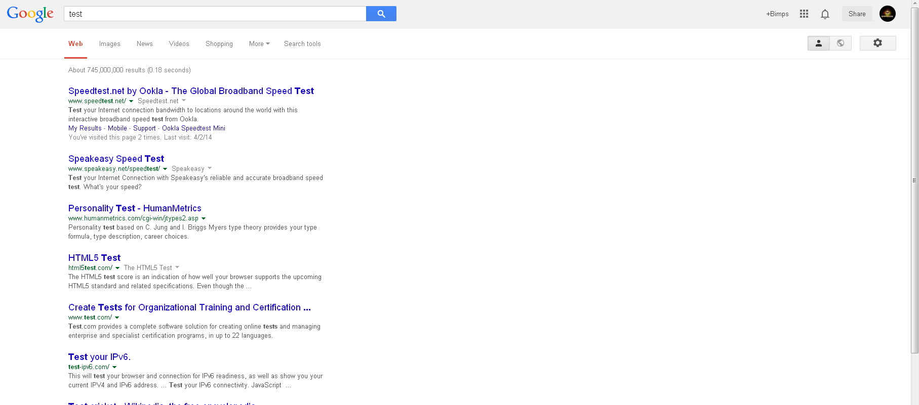
it's supposed to look like this?
because that looks horrible
Offline
#143 Before February 2015
- Different55
- Forum Admin

- Joined: 2015-02-07
- Posts: 16,575
Re: EEForumify Theme
The text on your screen isn't being antialiased. None of it. Not sure why. 12.16 looks fine, and 12.16 should render things exactly like 12.17. If you were using chrome, that'd make sense, since chrome has had issues with that in the past, but you're not. I'll check for any similar problems on any of the browsers/devices I have. In the meantime, can I get screenshots from you on this site, this site, and this site?
Last edited by Different55 (May 13 2014 8:34:16 pm)
"Sometimes failing a leap of faith is better than inching forward"
- ShinsukeIto
Offline
#144 Before February 2015
- Bimps
- Member
- Joined: 2015-02-08
- Posts: 5,067
Re: EEForumify Theme


the next one is comic sans because i previously set it to that because it makes me laugh
Offline
#145 Before February 2015
- Buzzerbee
- Forum Admin

- From: Texas, U.S.A.
- Joined: 2015-02-15
- Posts: 4,575
Re: EEForumify Theme
Updated the logo.
You updated it without changing the map coordinates, and now clicking the logo to return to index is slightly off.
Also I like the other logo better, without the slanted "FORUMS"
Last edited by BuzzerBee (May 14 2014 3:43:13 pm)

![]()
Offline
#146 Before February 2015
- Different55
- Forum Admin

- Joined: 2015-02-07
- Posts: 16,575
Re: EEForumify Theme
Oh, I thought usemaps used image coordinates. I've never seen them before this, actually. :/
Thanks for the vote.
http://i.gyazo.com/b0b10ee54224c2673f45476381ab3cce.png
http://i.gyazo.com/e21d49ead51d71d4e27d3c67bf98e6c6.png
the next one is comic sans because i previously set it to that because it makes me laugh
http://i.gyazo.com/198c51c34b24508e5a06ce873c6300f2.png
Are you sure you're using 12.17? I can't reproduce the issue with 12.16 (Debian/WINE/Windows XP) or 12.17 on Windows XP and WINE. What version of windows are you using?
Last edited by Different55 (May 14 2014 4:07:33 pm)
"Sometimes failing a leap of faith is better than inching forward"
- ShinsukeIto
Offline
#147 Before February 2015
- Buzzerbee
- Forum Admin

- From: Texas, U.S.A.
- Joined: 2015-02-15
- Posts: 4,575
Re: EEForumify Theme
Oh, I thought usemaps used image coordinates. I've never seen them before this, actually. :/
They do, but as you have changed the image, the coordinates are different.

![]()
Offline
#148 Before February 2015
- Different55
- Forum Admin

- Joined: 2015-02-07
- Posts: 16,575
Re: EEForumify Theme
Different55 wrote:Oh, I thought usemaps used image coordinates. I've never seen them before this, actually. :/
They do, but as you have changed the image, the coordinates are different.
Huh, I didn't figure that the images would be that different from each other. Alright, I'll get right on that.
Checked the coordinates. They're right, more or less. What's wrong is the large, invisible ul element that is now in the way. I have to use another method to float the navbar to the right, or use some other method to make that area clickable.
Last edited by Different55 (May 14 2014 5:09:24 pm)
"Sometimes failing a leap of faith is better than inching forward"
- ShinsukeIto
Offline
#149 Before February 2015
- Bimps
- Member
- Joined: 2015-02-08
- Posts: 5,067
Re: EEForumify Theme
yes i have confirmed i have 12.17, i use windows vista sp2 home premium. maybe ill mess with my font settings to see if that is the problem. can i have a comparable screen shot of the header from someone?
Offline
#150 Before February 2015
- Different55
- Forum Admin

- Joined: 2015-02-07
- Posts: 16,575
Offline
[ Started around 1732464967.1671 - Generated in 0.144 seconds, 12 queries executed - Memory usage: 1.78 MiB (Peak: 2.05 MiB) ]


