Official Everybody Edits Forums
Do you think I could just leave this part blank and it'd be okay? We're just going to replace the whole thing with a header image anyway, right?
You are not logged in.
- Topics: Active | Unanswered
#26 2018-08-02 03:24:36
- Norwee
- Formerly NorwegianboyEE

- From: Norway
- Joined: 2015-03-16
- Posts: 3,773
Re: Everybody Edits T-Shirts!
Hey guys wanna know how to stay a vurgen for life? Buy one of these shirts
Girls would throw their pant** at someone wearing the bruce t-shirt. :)
★ ☆ ★ ☆ ★
☆ ★ ★
Offline
#27 2018-08-02 03:25:21, last edited by hummerz5 (2018-08-02 04:03:38)
- Guest.
- Guest
Re: Everybody Edits T-Shirts!
▼CONTENT WARNING
(inappropriate content) -hz5
#28 2018-08-02 03:32:30, last edited by hummerz5 (2018-08-02 03:59:40)
- The Party Animal
- Formerly TPA2
- Joined: 2015-07-10
- Posts: 484
Re: Everybody Edits T-Shirts!
Kkay wrote:▼CONTENT WARNING▼CONTENT WARNING
why does the mouth look like a pocket ****? lmao
censor dodge - don't do it -hz5
Offline
#29 2018-08-02 03:57:31
- Kira
- Guest
Re: Everybody Edits T-Shirts!
Hi, no offence but those t-shirts aren't worth anyone's money.
If you're releasing t-shirt at least design something worth getting instead of slapping a smiley on top of one. But you know, we're looking at the peak of Kentiya's abilities there so I'm not surprised. A lot share the same opinion, so It's not just myself.
I sound negative, but criticism will improve your chances of selling some.
#30 2018-08-02 03:58:30
Re: Everybody Edits T-Shirts!
Quite frankly, these designs are horrible. I don't know why anyone would spend any money on this - just a black shirt with a smiley lazily slapped on it. If you want to sell tshirts, why dont you start by actually designing something? This kind of lazy **** won't cut it I'm afraid.
:.|:;
Offline
- Wooted by: (2)
#31 2018-08-02 04:00:00
- Joeyc
- Guest
Re: Everybody Edits T-Shirts!
Quite frankly, these designs are horrible. I don't know why anyone would spend any money on this - just a black shirt with a smiley lazily slapped on it. If you want to sell tshirts, why dont you start by actually designing something? This kind of lazy **** won't cut it I'm afraid.
LMAO, are you serious these shirts aren't half bad. What else do you want on it, a shirt with a snag smiley ?
#32 2018-08-02 04:03:42
Re: Everybody Edits T-Shirts!
Onjit wrote:Quite frankly, these designs are horrible. I don't know why anyone would spend any money on this - just a black shirt with a smiley lazily slapped on it. If you want to sell tshirts, why dont you start by actually designing something? This kind of lazy **** won't cut it I'm afraid.
LMAO, are you serious these shirts aren't half bad. What else do you want on it, a shirt with a snag smiley ?
dude just shut up
if you can't see that these shirts are awful you've got problems
:.|:;
Offline
- Wooted by:
- Wooted by:
#34 2018-08-02 04:10:59
Re: Everybody Edits T-Shirts!
We're looking at the peak of Kentiya's abilities there so I'm not surprised.
Not sure Kentiya had anything to do with these designs.
In regards to the suggested laziness, Josh recreated the Everybody Edits Globe from scratch to provide a much higher resolution version for these shirts. We've actually been spending a very long time overall getting these ready. ![]()
The smileys are also drastically increased higher quality versions designed specifically to fit on dark (ideally black) T-shirts. They're not just completely lifted from the versions existing in-game now. Believe it or not, you can't just resize a 16x16 image to 3000x3000 and throw it on a shirt hoping it'll look good. ![]()

Offline
#35 2018-08-02 04:40:45
- ByteArray
- Member
- From: United States
- Joined: 2015-02-17
- Posts: 158
Re: Everybody Edits T-Shirts!
Essentially, for shirt designs you want approximately 300dpi and no partial transparency. The NPC was simple enough: a nearest-neighbor upscale and flattening the antialiasing to a near-black. The smiley was a little trickier, since some of the antialiasing is more faint-- I removed some of the pixels that could end up too darker than the shirt itself, and lightened the ones that were questionable.
As Xenon said, the globe was another matter... The original globe logo would have been approximately 90dpi, so it would look very blurry on the shirt. So we needed a larger one, and of course there are very few of the original files. So first I replicated the angle of the sphere and FOV of the camera in Blender, and managed to get that done in an hour or so. Then the texture... We actually have the original texture that was mapped onto the sphere, but of course it had to be a JPG. ![]() On top of that, we noticed it had a bunch of weird alignment issues where the world sections were spliced together. So the next thing I did was to recreate the globe texture; I only really focused on the side of the texture you can actually see.
On top of that, we noticed it had a bunch of weird alignment issues where the world sections were spliced together. So the next thing I did was to recreate the globe texture; I only really focused on the side of the texture you can actually see. ![]()
After eventually getting that part done, I now had a textured sphere. Adding some of the basic shading was simple enough, with a little trial-and-error. Now, the tricky part came when I had to remake the "grunge" layer. I don't know if you've ever noticed, but there's some interesting shading that's especially noticeable around the edge of the globe; I really can only describe it as "grunge" or maybe "water-stains". Anyway, replicating this part took a while-- and it was so boring and tedious. ![]()
Once that was finally finished, I did some final shading adjustments and the globe was done! Now I took the text layer (that still existed, thankfully) from a Photoshop file and upscaled that, and its effects. I recreated the cursor as an SVG and got its shadow close enough, and copied an upscaled version of the ring-- except as you may recall, we shouldn't have partially transparent pixels! So I made a new ring as another SVG and shaded it to have some of the texture from the original. And after some final tweaks to make sure everything looked right, the design was complete. ![]()
I guess you can probably tell why the shirt with the globe design is more expensive. It was definitely worth it, though!
former lead-dev on EE/EEU, 2018—2020
(aka Criobite, Joshua Stone, TechnoWolf99, & LightWolf)
Offline
#36 2018-08-02 04:59:22
- Luka504
- Member

- From: Serbia,probs never heard of it
- Joined: 2015-02-19
- Posts: 2,934
Re: Everybody Edits T-Shirts!
This can only end well, can't it.
First of all these designs are really, really basic, with the exception of the EE logo. The EE logo looks pretty nice and detailed and is probably the only one I could potentially recommend for you to buy.
The other two designs are literally just the facebook sunglasses emoji and the NPC. They lack anything to make them worth the 20$ price tag and as such I don't believe anyone should buy them at their current price. Maybe if they're like 5 dollars, but even then maybe you should consider spending your money on something else.
But wait, you need two different T-shirts in order to be eligible to obtain one of the Fanboy smileys, but only one shirt is actually good. So no matter what you're going to have to buy a shirt you might not even want just because of a stupid smiley.
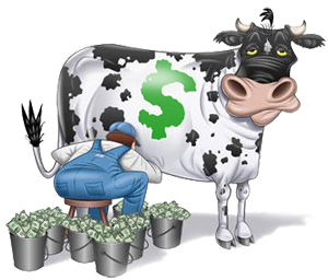
And that gives me a transition into my next point - This "Buy 2 T-shirts get a smiley" thing feels exploitative and morally ambiguous. If it was just a gem prize I could at least view it as "Hey thanks for buying our merch here's a bonus reward!", but as it is now it feels like you're just milking your audience for all they're worth, especially young children and people with compulsive personalities.
I'd like it if you stopped essentially charging 44$ dollars for a rare classic smiley.
How long will it take me to get banned again?
Place your bets right here.
Offline
- Wooted by:
#37 2018-08-02 05:14:56, last edited by Joeyc (2018-08-02 05:37:10)
- Joeyc
- Guest
Re: Everybody Edits T-Shirts!
This can only end well, can't it.
First of all these designs are really, really basic, with the exception of the EE logo. The EE logo looks pretty nice and detailed and is probably the only one I could potentially recommend for you to buy.
The other two designs are literally just the facebook sunglasses emoji and the NPC. They lack anything to make them worth the 20$ price tag and as such I don't believe anyone should buy them at their current price. Maybe if they're like 5 dollars, but even then maybe you should consider spending your money on something else.But wait, you need two different T-shirts in order to be eligible to obtain one of the Fanboy smileys, but only one shirt is actually good. So no matter what you're going to have to buy a shirt you might not even want just because of a stupid smiley.
And that gives me a transition into my next point - This "Buy 2 T-shirts get a smiley" thing feels exploitative and morally ambiguous. If it was just a gem prize I could at least view it as "Hey thanks for buying our merch here's a bonus reward!", but as it is now it feels like you're just milking your audience for all they're worth, especially young children and people with compulsive personalities.I'd like it if you stopped essentially charging 44$ dollars for a rare classic smiley.
nobody said you had to buy another shirt just to get both of them. even if the others are meh
Also, why would you wanna pay an extra 60 bucks to get your shirt when you can wait an extra 3 days with 8.99. seems kinda off for a price
#38 2018-08-02 06:10:56
- ILikeTofuuJoe
- Member
- From: Obvervable Universe
- Joined: 2018-06-04
- Posts: 1,770
- Website
Re: Everybody Edits T-Shirts!
t shirts are my least favorite
![]() ~meow~
~meow~ ![]()
Posting Goal: 2000
#Joe Griffin
Thanks HG for the signature and avatar!!!
Offline
#39 2018-08-02 09:08:44
- Zumza
- Member
- From: root
- Joined: 2015-02-17
- Posts: 4,662
Re: Everybody Edits T-Shirts!
Don't be scammed! It's cheaper on Amazon since 2014!

Warning!
This user has been found guilty by The Committee of Truth of using honesty, and reminding people of the past, without permission and outside of the allotted timeframes.
I’ve been asked if I’m ChatGPT5.
The answer is no.
I hope this helps! Let me know if you have any other questions.
Everybody edits, but some edit more than others
Offline
- Wooted by: (7)
#40 2018-08-02 10:17:03, last edited by Emma333 (2018-08-02 10:19:42)
- Emma333
- Member

- From: The Netherlands
- Joined: 2015-04-16
- Posts: 589
Re: Everybody Edits T-Shirts!
Two points:
- add a female size for the 1 girl that will ever buy one
- designs are indeed basic
Both are fixable, so no biggie, so think about it.
edit:
3rd point: not everybody likes to wear black. Make a lighter design too in the future!
Pm me with anything math related please
Offline
#41 2018-08-02 10:30:12
- peace
- Member

- From: admin land
- Joined: 2015-08-10
- Posts: 9,226
Re: Everybody Edits T-Shirts!
GG bew tT-shirts they look nci ebut im not buying them maby you coudl seel large amout to soeme clothes shops i think they are willing to sell some of these

thanks hg for making this much better and ty for my avatar aswell
Offline
#42 2018-08-02 10:54:56
- Kira
- Guest
Re: Everybody Edits T-Shirts!
You're naive if you think you can sell low effort t-shirts. You don't get a salary by clapping in your hands, same thing here. I can assure you that everything could be improved there, with minimal effort, resulting in a satisfied player base and less complaints.
- Wooted by: (2)
#43 2018-08-02 11:48:16
- Lictor666
- Guest
Re: Everybody Edits T-Shirts!
oh god... no... why... please... help...
we are THAT stupid for the dev team ?
- Wooted by:
#44 2018-08-02 12:06:43
- Kira
- Guest
Re: Everybody Edits T-Shirts!
This is almost too good of a comparison
- Wooted by: (2)
#45 2018-08-02 12:12:49
- Lictor666
- Guest
Re: Everybody Edits T-Shirts!
^^
#47 2018-08-02 15:47:22
Re: Everybody Edits T-Shirts!
- add a female size for the 1 girl that will ever buy one.
They're all purposely unisex. ![]()
not everybody likes to wear black. Make a lighter design too in the future!
It's something we're considering for future, but the designs we currently made are tailored towards darker shirts. The shading is completely wrong for lighter shirts, but we'll see for future. ![]()

Offline
- Wooted by:
#48 2018-08-02 21:47:36
- Helvi
- Member

- Joined: 2015-04-06
- Posts: 1,132
Re: Everybody Edits T-Shirts!
Why do the prices vary between _locations_ ?
Hi.
Offline
#49 2018-08-02 21:57:21
- Luka504
- Member

- From: Serbia,probs never heard of it
- Joined: 2015-02-19
- Posts: 2,934
Re: Everybody Edits T-Shirts!
Why do the prices vary between _locations_ ?
Shipping costs. If you live in the US it's cheaper to ship items in the US and more expensive to ship it in some other place like Europe or the UK.
How long will it take me to get banned again?
Place your bets right here.
Offline
#50 2018-08-02 22:03:21
- Joeyc
- Guest
Re: Everybody Edits T-Shirts!
it doesn't ship to australia how mean ![]() :mad:
:mad:
[ Started around 1745385842.0171 - Generated in 0.119 seconds, 12 queries executed - Memory usage: 1.82 MiB (Peak: 2.1 MiB) ]