Official Everybody Edits Forums
Do you think I could just leave this part blank and it'd be okay? We're just going to replace the whole thing with a header image anyway, right?
You are not logged in.
- Topics: Active | Unanswered
Pages: 1
#1 2018-01-11 04:37:30, last edited by Joeyc (2018-01-11 04:41:49)
- Joeyc
- Guest
Need Constructive criticism
So this is my very first time making graphics and I need some "Constructive criticism"
Do you guys think it's bad or good?
What do I need to improve on
First graphic: It's pretty bad

I find it okay
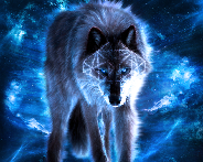
It's supposed to be a Winter 2nd Place Trophy ;p
P.S It's also the same one in my sig
- Wooted by:
#2 2018-01-11 05:14:28
- Bluecloud
- Member

- From: USA
- Joined: 2016-06-17
- Posts: 161

Re: Need Constructive criticism
Hey Joeyc! Nice for a first try (Better than mine) but I would suggest anti-aliasing
P.S. Skimmed through this, might help ya!
https://opengameart.org/content/chapter-6-anti-aliasing
goodbye ee, i'll miss you
Offline
#3 2018-01-11 13:24:33
- Tomahawk
- Forum Mod
- From: UK
- Joined: 2015-02-18
- Posts: 2,864

Re: Need Constructive criticism
Needs some AA and a bit of transparency at the edges, but it looks cool.
Maybe also a slightly darker border around the upper part.
One bot to rule them all, one bot to find them. One bot to bring them all... and with this cliché blind them.
Offline
- Wooted by:
#4 2018-01-11 15:44:26, last edited by Pyraklydd (2018-01-11 16:04:09)
- Pyraklydd
- Member
- Joined: 2017-12-14
- Posts: 31

Re: Need Constructive criticism
How's this?
+Snoflake Details (Some)
+Shading
+Glow
-Dark (slightly) Colouration
-Removed Nou
Other than that, amazing.
Thanks AnatolyEE for the Signature and HG for the Avatar!
My Graphics Creation Thread

Offline
#6 2018-01-11 19:03:35
- Joeyc
- Guest
Re: Need Constructive criticism
How's this?
https://imgur.com/vOKfdlw.png
+Snoflake Details (Some)
+Shading
+Glow
-Dark (slightly) Colouration
-Removed NouOther than that, amazing.
Yeah, a lot better than mine. lol
#7 2018-01-11 19:56:57, last edited by Latif (2018-01-11 22:04:51)
- Latif
- Member

- From: The Netherlands
- Joined: 2015-03-13
- Posts: 1,206

Re: Need Constructive criticism
Noooo, just no.
Are you kidding me:

What is this? I know it's your first graphic ![]() But I don't see you've experience with graphics. Its shape is really weird because there's no anti-aliasing. There's also no shading, it's just a flat graphic. Also, silver isn't cyan, it's light gray. Try looking at the contest trophies in EE and The darker pixels are barely visible zoomed out so it's like the whole graphic is 1 color., and it doesn't even look like a snowflake trophy.
But I don't see you've experience with graphics. Its shape is really weird because there's no anti-aliasing. There's also no shading, it's just a flat graphic. Also, silver isn't cyan, it's light gray. Try looking at the contest trophies in EE and The darker pixels are barely visible zoomed out so it's like the whole graphic is 1 color., and it doesn't even look like a snowflake trophy.
Take a look at TOOP's trophies:
Copy it and paste it in your paint program. Zoom in and try to learn from it. Unfortunately, it's not that easy to make graphics. I am also not really good at it but I definitely have some experience. The best tip I can give you is PRACTICE. Keep making graphics, and try to improve. Start with some simple things, making trophies is a bit hard. Try making some solid blocks or something. Learn from your previous graphics and always try a bit harder (not too hard).

This one is a bit better, it's still very flat because there's no shading. Anti-aliasing is good enough and the glow looks nice, it fits well. It can still get some work. The color is still the same in the entire graphic (except the glow), and this also doesn't look like a snowflake trophy too.
Offline
#8 2018-01-12 01:45:04
- BuzzerBee
- Forum Admin

- Joined: 2015-02-15
- Posts: 4,578

Re: Need Constructive criticism
Moved to graphics suggestions

![]()
Offline
#9 2018-01-12 20:44:44, last edited by Pyraklydd (2018-01-12 20:53:24)
- Pyraklydd
- Member
- Joined: 2017-12-14
- Posts: 31
Re: Need Constructive criticism
Hey, from what you made I got the idea to make this:
You can edit it if it's not good enough, like I did.
Listened to Latif's advice.
--------------------------------------------------------------
EDIT:
Working on fixing bowtie. It isn't too visible.
Fix:
Thanks AnatolyEE for the Signature and HG for the Avatar!
My Graphics Creation Thread
Offline
#10 2018-01-12 20:50:17
- Joeyc
- Guest
Re: Need Constructive criticism
I told you guys the graphic is horrible, and yes. I've never used any of those paint tools or whatever in my life.
#11 2018-01-12 20:52:43, last edited by Pyraklydd (2018-01-12 20:52:52)
- Pyraklydd
- Member
- Joined: 2017-12-14
- Posts: 31
Re: Need Constructive criticism
Don't be so hard on yourself.
Believe and try, as Latif said.
Who cares if you made some mistakes here and there? Everybody does. Even the most succesful artist.
Just keep trying and don't take peoples'/our judgement too hard. We're just suggesting. It doesn't mean it isn't good.
Thanks AnatolyEE for the Signature and HG for the Avatar!
My Graphics Creation Thread
Offline
Pages: 1
[ Started around 1749076088.3726 - Generated in 0.093 seconds, 12 queries executed - Memory usage: 1.53 MiB (Peak: 1.7 MiB) ]