Official Everybody Edits Forums
Do you think I could just leave this part blank and it'd be okay? We're just going to replace the whole thing with a header image anyway, right?
You are not logged in.
- Topics: Active | Unanswered
Pages: 1
#1 2016-12-21 03:04:26, last edited by medeia (2016-12-21 14:37:45)
- medeia
- Banned

- From: State Farm
- Joined: 2016-11-25
- Posts: 193
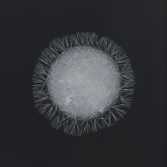
Snow Flake aura


Also, I was not aware of a proper aura size, Thank you.
Remmoze wrote:It's too pixelated. make it smooth.
▼
Credit to DarkComet, The re texture is great. I can't thank you enough.


Offline
- Wooted by: (2)
#2 2016-12-21 08:02:46
- dcomet
- Member

- From: Dipstick Kingdom
- Joined: 2016-11-20
- Posts: 788
Re: Snow Flake aura
Why not post in the same topic? Anyway, good concept! ![]()


@MAMETCHl on twitter for the pfp artist, @snuffyowo on twitter for the character drawn in the pfp.
Offline
#3 2016-12-21 09:28:43, last edited by Gosha (2016-12-21 09:29:09)
- Gosha
- Member
- From: Russia
- Joined: 2015-03-15
- Posts: 6,211
Re: Snow Flake aura
Too small.
inside ring - your aura
outside ring - original spinning aura
EDIT: Also, it's too pixelated. make it smooth
Offline
#4 2016-12-21 09:34:18
- Gosha
- Member
- From: Russia
- Joined: 2015-03-15
- Posts: 6,211
Re: Snow Flake aura
made it larger, editing little little bit.
Guys, this looks cool
Offline
- Wooted by: (4)
#5 2016-12-21 09:52:43, last edited by dcomet (2016-12-21 10:30:08)
- dcomet
- Member

- From: Dipstick Kingdom
- Joined: 2016-11-20
- Posts: 788
Re: Snow Flake aura
It's too pixelated. make it smooth.


@MAMETCHl on twitter for the pfp artist, @snuffyowo on twitter for the character drawn in the pfp.
Offline
- Wooted by: (2)
#6 2016-12-21 10:27:54, last edited by Gosha (2016-12-21 10:29:48)
- Gosha
- Member
- From: Russia
- Joined: 2015-03-15
- Posts: 6,211
Re: Snow Flake aura
much better
EDIT:
It's 32x32 because idk the dimensions of the auras.
here. take this
Offline
- Wooted by: (3)
#7 2016-12-21 10:31:11
- dcomet
- Member

- From: Dipstick Kingdom
- Joined: 2016-11-20
- Posts: 788
Re: Snow Flake aura
much better
http://i.imgur.com/QW3OfP7.gifEDIT:
DarkComet wrote:It's 32x32 because idk the dimensions of the auras.
here. take this
http://i.imgur.com/6ry6216.png
wow thx


@MAMETCHl on twitter for the pfp artist, @snuffyowo on twitter for the character drawn in the pfp.
Offline
#8 2016-12-21 12:16:23, last edited by skullz17 (2016-12-21 14:43:07)
- skullz17
- Member

- Joined: 2015-02-15
- Posts: 6,699
Re: Snow Flake aura
Doesn't even look like a snowflake after m night shyamalan's The Smoothening.

thx for sig bobithan
Offline
#9 2016-12-21 14:33:28
- medeia
- Banned

- From: State Farm
- Joined: 2016-11-25
- Posts: 193
Re: Snow Flake aura
Doesn't even look like a snowflake after m night shyamalan's the smoothening.
I was looking for community input, But the opinion is greatly valued.
Remmoze wrote:It's too pixelated. make it smooth.
▼
Thank you as well, I will add this to the main topic. (credits as always)


Offline
Pages: 1
[ Started around 1732255381.8489 - Generated in 0.109 seconds, 12 queries executed - Memory usage: 1.58 MiB (Peak: 1.76 MiB) ]


