Official Everybody Edits Forums
Do you think I could just leave this part blank and it'd be okay? We're just going to replace the whole thing with a header image anyway, right?
You are not logged in.
- Topics: Active | Unanswered
Pages: 1
#1 Before February 2015
- jakebot
- Guest
Jakebot's Angel Smiley
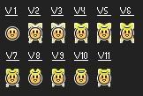
This is v9 on the left v10 in the middle and v11 on the right.

And here is an "evolution" of it,

From left to right:
1)I combined the worker smiley's mouth with the cheeks from the Valentine's Day smiley and the eyes from the default smiley.
2)Added the wings.
3)Refined the detail in the wings (look at the bottom of the smiley between the wings) and removed the flare at the bottom of the wings.
4)Added the halo.
5)Moved the wings farther apart and touched up where the wings meet the body.
6)Darkened the halo, made the bottom wings skinnier and darkened the area on the top of it's head.
7)Made the wings smaller and made the halo even darker.
8)Scrapped the wings altogether and just left the original smiley with the halo.
9)Made the bottom wings from v7 less squarish and more round.
10)Drew a completed halo on the v8 angel
11)Drew a completed halo on the v9 smiley
Please post some constructive criticism! +rep me if you like it!
FAQ:
Q:But the height is more than 16 pixels, it can't be put into the game.
A:It fits all the size requirements of the wizard. The newer versions (v7, v8, v9, v10 and v11) are even smaller than that.
Q: The wings are to close apart, can you move them?
A: Well, no, not really. The smiley is already maxed out on width, but I'll do the best i can to make it look better.
EDIT: Posted evolution #5 and posted a v9,v10 and v11 image.
Last edited by jakebot (Jun 17 2011 9:42:06 am)
#2 Before February 2015
- coolio
- Guest
Re: Jakebot's Angel Smiley
whoa. LUV IT. But could you make it so that the wings are a little farther apart? I first thought it was a merged smiley sitting in a chair.
And could you make the background of the finished version normal? I can't see it well.
Other than that, two thumbs up!
#3 Before February 2015
- jakebot
- Guest
Re: Jakebot's Angel Smiley
Well I'm pretty much maxed out on the width but I might be able to move it another pixel or two.
Just a quick tune up, and here it is. +Rep if you like it!

The old one is on the left with the new one on the right. I also touched up a bit where the wings meet the body.
Personally I like v4 better than the new one. Let me know what you think.
Last edited by jakebot (Jun 15 2011 4:44:20 pm)
#4 Before February 2015
- Glitcherkid
- Member

- Joined: 2015-02-17
- Posts: 909
Re: Jakebot's Angel Smiley
hey, it looks like you used my blushing smiley for a start... but you didnt, there r minor changes.

Offline
#5 Before February 2015
- jakebot
- Guest
Re: Jakebot's Angel Smiley
I didn't do anything with your smiley, as I said in the original post I,
combined the worker smiley's mouth with the cheeks from the Valentine's Day smiley and the eyes from the default smiley.
#6 Before February 2015
- Shy Guy
- Guest
Re: Jakebot's Angel Smiley
Why don't we just rip-off the angel smiley from facebook?
Right, Chris?
Last edited by Shy Guy (Jun 15 2011 6:24:51 pm)
#7 Before February 2015
- jakebot
- Guest
Re: Jakebot's Angel Smiley
That was what I was trying to avoid. Thats why I drew this one, plus I like mine more (but it could be just me).
#8 Before February 2015
- JadElClemens
- Member
- From: Colorado, USA
- Joined: 2015-02-15
- Posts: 4,559
Re: Jakebot's Angel Smiley
I was so disappoint when I learned that Chris had stolen the EE smileys from facebook (lazy... person).
Anywho, awesome smiley! I'd like it if the wings were farther apart and the halo was more contrasted to the wings.

I hate tall signatures.
Offline
#9 Before February 2015
- Glitcherkid
- Member

- Joined: 2015-02-17
- Posts: 909
Re: Jakebot's Angel Smiley
I didn't do anything with your smiley, as I said in the original post I,
Jakebot wrote:combined the worker smiley's mouth with the cheeks from the Valentine's Day smiley and the eyes from the default smiley.
Thats why i said
it looks like you used my blushing smiley for a start
Last edited by Glitcherkid (Jun 15 2011 7:18:38 pm)

Offline
#10 Before February 2015
- jakebot
- Guest
Re: Jakebot's Angel Smiley
So what are you trying to say?
Well anyway the width is already maxed out with the wings, but I agree with you that the halo needs to contrast with the wings more.
#11 Before February 2015
- Infinity7
- Guest
Re: Jakebot's Angel Smiley
the halo looks messed up
#12 Before February 2015
- jakebot
- Guest
Re: Jakebot's Angel Smiley
Why? Can you elaborate on that so I can fix it?
#13 Before February 2015
- simpleguest
- Guest
Re: Jakebot's Angel Smiley
I think the halo is kinda mixed into the wings. If you could make the wings a bit darker into the background the halo would stand out more and not look like part of the wings as much.
#14 Before February 2015
- JadElClemens
- Member
- From: Colorado, USA
- Joined: 2015-02-15
- Posts: 4,559
Re: Jakebot's Angel Smiley
Well, the wings would be too high anyway. RPG had originally made the bunny smiley to fit the size of the wizard, but Chris told him to reduce the size. Just make the wings wider in one version, and the right size in another.

I hate tall signatures.
Offline
#15 Before February 2015
- jakebot
- Guest
Re: Jakebot's Angel Smiley
How high can the wings go?
Well for v6 I darkened the halo and cut the wings in on the outside (they're skinnier) and I darkened the top of the head.

And here's the evolution:

Last edited by jakebot (Jun 16 2011 7:26:42 am)
#16 Before February 2015
- Betaguy
- Guest
Re: Jakebot's Angel Smiley
I like it better without the wings...
#17 Before February 2015
- jakebot
- Guest
Re: Jakebot's Angel Smiley
But then its not an angel smiley.
#18 Before February 2015
- Muffin
- Guest
Re: Jakebot's Angel Smiley
Try making it with just the basic smiley and a halo.
#19 Before February 2015
- Violetrose
- Guest
Re: Jakebot's Angel Smiley
It's a little bit hard to see the halo on the latest one. It blends in with the wings a bit. It would be better if you took out the wings. It would still be an angel with the halo.
#20 Before February 2015
- jakebot
- Guest
Re: Jakebot's Angel Smiley
Here are two new versions, one without the wings and the other with smaller wings and a darker halo. (The second is my personal favorite)

Honestly though I think the wings on the bottom are too squarish. Meh, I'll fix that in my next post.
Last edited by jakebot (Jun 16 2011 6:25:49 pm)
#21 Before February 2015
- Infinity7
- Guest
Re: Jakebot's Angel Smiley
It doesn't look completley like an angel smiley now ![]()
#22 Before February 2015
- jakebot
- Guest
Re: Jakebot's Angel Smiley
I have made three more versions now, (v9, v10 and v11). v9 has the wings at the bottom smoother and less squarish than in v7. In v10 I drew a complete halo, instead of it cutting off in the back. And v11 is basically v9 with a completed halo.

v9, v10, v11
Last edited by jakebot (Jun 17 2011 9:36:55 am)
#23 Before February 2015
- JadElClemens
- Member
- From: Colorado, USA
- Joined: 2015-02-15
- Posts: 4,559
Re: Jakebot's Angel Smiley
v11 is easily the best yet, I love it!
Don't change the facial features, they look great!
Awesome job.

I hate tall signatures.
Offline
#24 Before February 2015
- jakebot
- Guest
Re: Jakebot's Angel Smiley
The facial features have remained the same throughout. Thanks for your opinion. ![]()
Last edited by jakebot (Jun 17 2011 3:26:30 pm)
Pages: 1
[ Started around 1732742068.6306 - Generated in 0.122 seconds, 12 queries executed - Memory usage: 1.59 MiB (Peak: 1.79 MiB) ]