Official Everybody Edits Forums
Do you think I could just leave this part blank and it'd be okay? We're just going to replace the whole thing with a header image anyway, right?
You are not logged in.
- Topics: Active | Unanswered
#1 Before February 2015
Ways to Display Bricks [Community Effort!]
Don't like the tabs? I, for one, find them a moderate nuisance; but they do get the job done of sorting out the bricks instead of having a massive window of all my bricks.
Here's my suggestion:
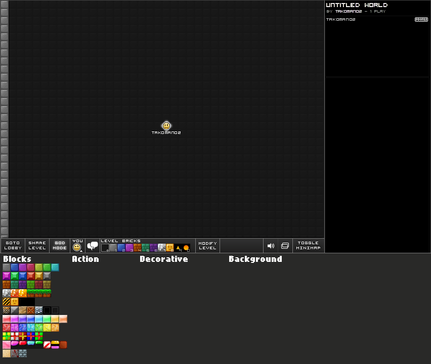
Click to see full sizeChanges:
? The first obvious change you see is the increased lower portion of the game field.
? Each brick is available with just one click, as compared to 2-5 clicks as it stands.
? The second change is, I removed the titles from each block group. This change has been made not only to save space, but to make things look a little neater.
? The third unimportant change is I removed "More Blocks" from the Quickbar, as there are no more block to show.Notice: I didn't finish, but I hope you understand where I was going with this. I had also planned on making the chat box larger, but that's irrelevant. And maybe some dividers in between each category.
-----
Do you like the tabs, but hate how they take up a lot of space? Do you prefer to have them on the left or right? Everyone has their own replacements for block representation. This is fine. All you need to do is give a detailed and descriptive explanation of your idea and I will "draw" a picture and post it here (only if it's good ;D), just for sake of visual representation. Be sure to think outside the box and give us a really great replacement!
In a couple weeks or so we might have a vote, or ask RPGMaster2000 what he thinks of them.
-----
If you wish to create your own representation, here are some helpful links:
The font that is used for the block categories
The font that is used to label block group names
A random "More Blocks" tab
Last edited by Tako (Jan 15 2012 11:17:01 am)
Yeah, well, you know that's just like, uh, your opinion, man.
Offline
#2 Before February 2015
- Furkansmr
- Guest
Re: Ways to Display Bricks [Community Effort!]
Nice but it makes big screen and i think it cant in 800x600 screen.
#3 Before February 2015
Offline
#4 Before February 2015
- John
- Member
- Joined: 2019-01-11
- Posts: 1,982

Re: Ways to Display Bricks [Community Effort!]
Yes! I agree! The tabs are annoying!
Offline
#5 Before February 2015
- willard b
- Guest
Re: Ways to Display Bricks [Community Effort!]
Great idea! Though Furkansmr was on the right track; that would make the blocks window too oversized. And therefore the only way to really build anything is to add blocks to your hotbar and constantly keep changing your hotbar.
Why is that bad? For people like me that use a wide variety of blocks (more than 9 at a time) that would be outrageous. The tabs thing is annoying as it is, but that would be worse.
TL;DR we need a bricks window that would hold all the bricks, action, BG, and decorative in one drop-down. And the drop-down can't be any bigger than the current one.
So how about we make the blocks into thumbnails; make each block 8*8 rather than 16*16, that would save some space at least.
#6 Before February 2015
- JadElClemens
- Member
- From: Colorado, USA
- Joined: 2015-02-15
- Posts: 4,559
Re: Ways to Display Bricks [Community Effort!]
I don't like the idea of tabs, but... I hope the "not finished" part included not having just a giant tower of bricks there. I agree, remove the titles and lessen spacing between groups, but a giant tower? OH GOD NO.

I hate tall signatures.
Offline
#7 Before February 2015
- Shift
- Guest
Re: Ways to Display Bricks [Community Effort!]
Personally, I like it how it is. It's spacious, but in a good way. Your suggestion is all cluttered yet still takes up a lot of room.
#8 Before February 2015
- Tree
- Guest
Re: Ways to Display Bricks [Community Effort!]
Furkansmr wrote:Nice but it makes big screen and i think it cant in 800x600 screen.
Learn to scroll :O
Most games are designed so that you dont have to scroll up and down
#9 Before February 2015
Re: Ways to Display Bricks [Community Effort!]
@jad and shift: Okay, how about horizontal rows instead of towers?
@Tree: you must've not played very many games ![]()
@willard b: 8x8 seems very small. 16x16 is just right in my opinion. Perhaps horizontal rows would be more space-efficient.
Yeah, well, you know that's just like, uh, your opinion, man.
Offline
#10 Before February 2015
- ILoveBacon
- Guest
Re: Ways to Display Bricks [Community Effort!]
You should make a "tabs" option a "rows" and a "coloums" option ect. That way you can have it how you want it!
#11 Before February 2015
- Shift
- Guest
Re: Ways to Display Bricks [Community Effort!]
Okay, how about horizontal rows instead of towers?
That's better, but I still prefer the current setup.
#12 Before February 2015
- baxdar
- Guest
Re: Ways to Display Bricks [Community Effort!]
i don't know it could work. but what if you are like me and have alot of bricks and misc items. plus i play in full screen mode a ton so this would make it very hard to play
[ Started around 1714497242.8719 - Generated in 0.070 seconds, 12 queries executed - Memory usage: 1.48 MiB (Peak: 1.63 MiB) ]