Official Everybody Edits Forums
Do you think I could just leave this part blank and it'd be okay? We're just going to replace the whole thing with a header image anyway, right?
You are not logged in.
- Topics: Active | Unanswered
#1 Before February 2015
- supadorf24
- Member
- Joined: 2015-02-26
- Posts: 2,675
Supa's List of Things That Will Frustrate Your Players
I like guides like this. Other people like guides like this. So I made a guide like this. Follow these steps, and people won't ragequit or borequit your levels. These all come from my personal experience, what frustrates me in levels, and what ultimately drives me to quit a level. Also, enjoy my fine screenshots of a world I made in ten minutes.
So, without further ado . . .
don't do these:
1. Sharp Learning Curve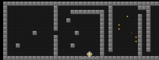
Look at the picture above. Notice the first two minigames. Easy, right? Now, turn your attention to minigame three. Brutal. Possible, but at a level of difficulty where it's not even fun. This is a huge turnoff to players. You're cruising through a ton of easy minigames, and then, bam! You're stuck. When you're making a level, pretend you're developing a video game. You have to make sure that the game eases into challenges. If you start off with hard minis, the player will just leave. If you force the player to overcome lots of minis before a hard one, the player has a sense of accomplishment that they won't just want to throw away by quitting.
2. HOOK JUMPS!!!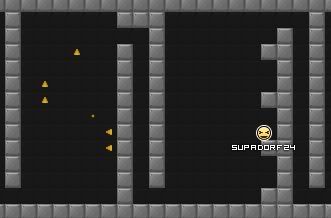
SELF-EXPLANATORY. You've probably already heard me or someone else rant about hook jumps before, so I'll skip this one.
3. The Impossibility Test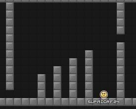
If you've ever made a level before, you know that you should test it to make sure it's possible. When you're testing, though, there's something else you should be on the lookout for: traps. Occasionally, you will inadvertently create traps. Like in the picture above, a trap could be as blatant as a pit you can't get out of, but sometimes, traps can be hard to spot. So, while a level may be 100% possible, it's also 100% possible that someone could get stuck in your level. Patrol your level often to make sure no one is stuck.
4. Unoriginality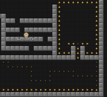
Yes, it's been done before. It's been done over and over. And that means it's been played over and over. And that means players don't want to play it again. The picture above showcases three generic minis that players don't want to play. You want players to have fun? Avoid these.
5. False Promises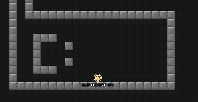
Don't say the code is at the end of the level if the it isn't. This will only lead to frustration. Plus, someone that got to the end of your level might tell everyone that there's no code, and this will generally associate your level with a negative image. If your level is genuinely fun, people will enjoy it for what it is. 'Nuff said.
6. Bad Art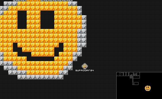
Art is a fun aspect of EE. It's fun to make and it's fun to see. Unless it's not good. There are plenty of friendly people on the forums here that would be more than glad to help you out, so don't be hesitant to ask for assistance on the Level Creation forum. There's nothing worse than an ugly minimap. However, this doesn't mean you need to fill your world with artwork. By coloring your minis or just adding random swirlies, you can spice up your map. Even adding words like, "MADE BY SUPADORF24," can fill your map with fun. My art teacher always tells me to fill the page. EE is no exception.
7. For the Love of God, Don't Trap People on Purpose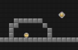
I've really only seen this done in extremely n00bish worlds. The picture pretty much explains everything. I know you may think it's fun to torture your players like ants, but it's not fun for them, especially if they've almost reached the end.
End Result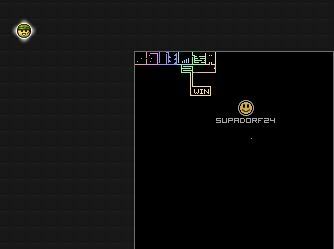
Compare the above picture with Bad Art's picture. See what a little bit of color can do for your levels? Also, notice how I've fixed the traps and replaced the fake code with a "WIN" box. Avoid the seven categories above, and you'll be one step closer to making better levels.
_____________________________________
I made this guide in hopes of making EE more fun. I know there are already guides out there, like Sai's topic. But Sai's topic is full of specific minis to avoid, while this is completely different. This guide is the brainchild of people's complaints and my personal experience. I made this while watching SNL, so if there are any mistakes, feel free to tell me. If there is already a guide exactly like this, I will remove this, but as far as I know, this is an original guide.
EDIT: I just found out that this very similar to Takoman02's guide, so I'm trying to differ it.
Last edited by supadorf24 (Mar 13 2011 9:57:14 am)
Offline
#2 Before February 2015
Re: Supa's List of Things That Will Frustrate Your Players
I made a topic almost exactly like this a few weeks back. Topics come and go, then someone will comment on it and it'll come back to life. The average life of a topic.
Yeah, well, you know that's just like, uh, your opinion, man.
Offline
#3 Before February 2015
- supadorf24
- Member
- Joined: 2015-02-26
- Posts: 2,675
Re: Supa's List of Things That Will Frustrate Your Players
You're right! Wow. It looks like for my Bad Art section, I even pretty much used the same sentence. Lemme see if I can change my guide a little bit so it's not so similar. Whoops, sorry about that!
EDIT: Actually, I don't have time to fix it now. I'll fix it in the morning. I think we just share the same ideas when it comes to annoying things.
EDIT2: I've made a few small changes, but looking at it now, I see that are guide is are different in the sense that you have a lot of things I don't, I have some things you don't, and yours is more of a list while mine is more of a guide. Which isn't a bad thing, because lists are easier to read.
Last edited by supadorf24 (Mar 13 2011 9:59:00 am)
Offline
#4 Before February 2015
- Jeremiax96
- Guest
Re: Supa's List of Things That Will Frustrate Your Players
Thanks men! Tomorrow I fix my level "BK Hotel Minis4Code". The minigames are so boring and dificult. Now I got more colors and I'm going to make a colorful world. And with originals minigames. If you want, look the boring minigames here:
#5 Before February 2015
- JadElClemens
- Member
- From: Colorado, USA
- Joined: 2015-02-15
- Posts: 4,559
Re: Supa's List of Things That Will Frustrate Your Players
Good topic, +rep

I hate tall signatures.
Offline
[ Started around 1732494214.369 - Generated in 0.068 seconds, 12 queries executed - Memory usage: 1.43 MiB (Peak: 1.54 MiB) ]