Official Everybody Edits Forums
Do you think I could just leave this part blank and it'd be okay? We're just going to replace the whole thing with a header image anyway, right?
You are not logged in.
- Topics: Active | Unanswered
Pages: 1
#1 Before February 2015
- EENinja
- Guest
Ace Team - Silent Hill
This is Ace Teams 3rd level ![]()
The basic idea of it is that there is a nice side, and a dark side. We began with the top then made the bottom a darker version.
I had a great time building this level, also I was highly impressed at how our new members (Espically Kingpooultra) really took there art skill to another level. Great work guys.

Good luck, + Reps for winners ![]()
#2 Before February 2015
- theredtigers
- Guest
Re: Ace Team - Silent Hill
very cool lvl and cool houses but the sky is a bit empty
#3 Before February 2015
- manurthebest
- Guest
Re: Ace Team - Silent Hill
Liked it, pretty fun minis and nice art. Although some minis were box mins ![]()
Last edited by manurthebest (Nov 19 2011 12:49:02 pm)
#4 Before February 2015
- MRBOOGAWESOME
- Guest
Re: Ace Team - Silent Hill
The world is a bit plain, and those clouds they have no shading :/
#5 Before February 2015
- Ralaina
- Guest
Re: Ace Team - Silent Hill
The world is quite plain because it's supposed to be just your every day average town. And we have been working on it for so long that we decided to release it, even though some parts aren't the best.
#6 Before February 2015
- EENinja
- Guest
Re: Ace Team - Silent Hill
Liked it, pretty fun minis and nice art. Although some minis were box mins
Im sorry about the boxes ![]()
Ace Team has no mini maker, so I made them.
I know I can do better as well.
Last edited by EENinja (Nov 18 2011 12:47:06 pm)
#7 Before February 2015
- Epicfish
- Guest
Re: Ace Team - Silent Hill
Oh wow; this sort of map was mine and SquadFS's first idea for a Halloween map.
In terms of the map itself, the art seems relatively nice, if not totally 3d/shaded.
Looks quite nice though, I'll play it once I've progressed on my map.
#8 Before February 2015
- Yankeestar180
- Guest
Re: Ace Team - Silent Hill
I feel this relates to time is killing me by supa...
But clouds looks unshaded to me, the word minimart looks VERY plain
The world needs grass, just looks like the halves are flying.
Ill post my win pic later. ![]()
#9 Before February 2015
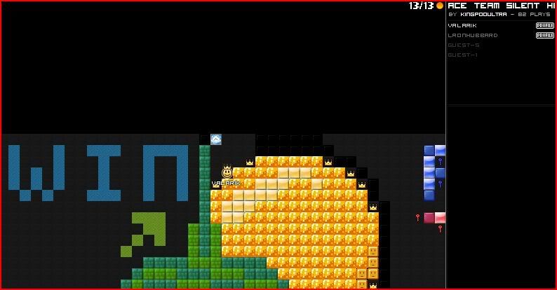
- Valarik
- Guest
Re: Ace Team - Silent Hill
#10 Before February 2015
- EENinja
- Guest
Re: Ace Team - Silent Hill
Nice to see a couple of winners ![]()
Also in the end, we had been mucking around with this world for sooo long that we just quickly finished it off.
Edit: Just realised I had promised + Reps ![]()
Pages: 1
[ Started around 1739382508.0127 - Generated in 0.045 seconds, 12 queries executed - Memory usage: 1.43 MiB (Peak: 1.55 MiB) ]