Official Everybody Edits Forums
Do you think I could just leave this part blank and it'd be okay? We're just going to replace the whole thing with a header image anyway, right?
You are not logged in.
- Topics: Active | Unanswered
Pages: 1
#2 Before February 2015
- Zakleo
- Guest
Re: I Crew Messy Mechanics
Yay it's finally finished!
Hope you guys have as much fun playing it as we had making it ^^
Last edited by zakleo (Apr 17 2012 1:58:39 pm)
#3 Before February 2015
- Helvi
- Member

- Joined: 2015-04-06
- Posts: 1,132
Re: I Crew Messy Mechanics
Judging from the map it seems to be an very nice and interested to play design. But the poor mini design of the very first one is a blocker for most people. Adjusting it to make it playable for most others.
Hi.
Offline
#4 Before February 2015
- Sancti
- Guest
Re: I Crew Messy Mechanics
My view on the level:
Mini-wise: Really annoying at some times, though I liked some. Got stuck after the 6th coin (green tube thing). Seemingly the level makers can't complete it to so I suggest you guys change it, only one I saw finishing it was MIHB.
Art-wise: Nice, well worked out with good shading. But if you do 3D boxes make them all 3D, not just 3. Good mini concept, but I've seen it before (:
#5 Before February 2015
- OrangeCrix
- Member
- Joined: 2015-03-01
- Posts: 266
Re: I Crew Messy Mechanics
You told me to leave a comment, so here it is.
Offline
#6 Before February 2015
- hytres1
- Guest
Re: I Crew Messy Mechanics
most of the minis are funny, others are a bit confuse.
9.5/10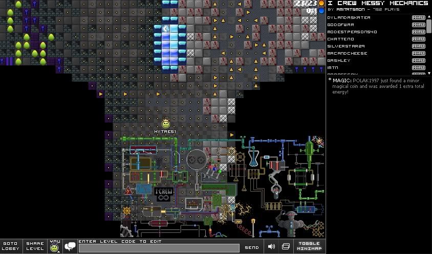
#7 Before February 2015
- Arceus64
- Guest
Re: I Crew Messy Mechanics

Last edited by Arceus64 (Apr 17 2012 3:46:35 pm)
#8 Before February 2015
- Muffin
- Guest
Re: I Crew Messy Mechanics
Oh gosh. The art is all over the place, and the minis are just... bleh. I missed 1 coin, and the room that looks like a party kinda is almost impossible, or atleast there's no good way to do it. You should never start out a level with such ragey minigames.
3/10, I just didn't enjoy it.
#9 Before February 2015
- Muffy
- Guest
Re: I Crew Messy Mechanics
The art looks ok,by ok,I mean bad looking,though it might just be a level for good minis,it doesn't seem like other favor the mini more art.Any ways good job on finishing it.
#10 Before February 2015
- MIHB
- Guest
Re: I Crew Messy Mechanics
All in all, I enjoyed it quite a bit. However, there are a few rooms which are very badly designed, in particular the first and the 10th(10 coins?) room. Having such a bad first room is just asking for trouble, especially since the part that you "fixed" was the upper part, which was fine, but you left the bad part (the bottom) unchanged.
Work a bit more on polishing the rooms and getting a more consistent difficulty flow (I literally spent maybe 20 seconds on the last room), and there is some real potential here.
#11 Before February 2015
- EECguy
- Guest
Re: I Crew Messy Mechanics
Ummmm.... i couldn't pass the first room ![]() but cool map design
but cool map design ![]()
#12 Before February 2015
- ZeroStar
- Guest
Re: I Crew Messy Mechanics
Raged on 10th coin mini. Also pretty sure I was exploiting it and it was still pretty hard.
Last edited by ZeroStar (Apr 17 2012 8:45:14 pm)
#13 Before February 2015
- DKZero
- Guest
Re: I Crew Messy Mechanics
Looks good.
Was fun.
Didn´t win...
#14 Before February 2015
- theditor
- Member
- Joined: 2015-02-18
- Posts: 1,320
Re: I Crew Messy Mechanics
Nice art,some things look awesome ![]()
Minis need some tuning,but they are fine.
I like your levels a lot,so keep going!
Best wishes to you,guys!
~Theditor
Offline
#15 Before February 2015
- skullz17
- Member

- Joined: 2015-02-15
- Posts: 6,699
Re: I Crew Messy Mechanics
I think the first mini is harder than the second but for me it was opposite (or maybe I was doing the wrong thing).

thx for sig bobithan
Offline
#16 Before February 2015
- Zakleo
- Guest
Re: I Crew Messy Mechanics
Tomorow we will change the first mini (that's if Amit agrees)
#17 Before February 2015
- ani
- Member

- Joined: 2015-02-17
- Posts: 649
Re: I Crew Messy Mechanics
The art is awesome, but the difficulty of the gameplay is like a rollercoaster.
ヽ(•‿•)ノ ❤ ♬ ✩ t u t u r u !~ ✧☁ ☂ ヽ(•‿•)ノ
Offline
#18 Before February 2015
- Polis
- Member

- Joined: 2015-02-23
- Posts: 440
Re: I Crew Messy Mechanics
*Attention - The minis are not easy to hard, they are sometimes easy and sometimes hard.
I hope this explains it Fuzzysocks.
Last edited by Polis (Apr 19 2012 5:41:50 am)
Offline
#19 Before February 2015
- capasha
- Member

- Joined: 2015-02-21
- Posts: 4,066
Re: I Crew Messy Mechanics
Nice world. Can I join your crew???
Offline
#20 Before February 2015
- Zakleo
- Guest
Re: I Crew Messy Mechanics
You'll have to PM Amit that, on CS, he rarely visits forum.
EDIT: I can't double post so I'm just gonna post what I was gonna post here: I changed the first mini, but Amit didn't like it - So the map is staying the same
Last edited by zakleo (Apr 21 2012 5:31:26 am)
Pages: 1
[ Started around 1732699008.9913 - Generated in 0.330 seconds, 16 queries executed - Memory usage: 1.54 MiB (Peak: 1.7 MiB) ]
