Official Everybody Edits Forums
Do you think I could just leave this part blank and it'd be okay? We're just going to replace the whole thing with a header image anyway, right?
You are not logged in.
- Topics: Active | Unanswered
#26 Before February 2015
- Bobithan
- Member

- Joined: 2015-02-15
- Posts: 4,476

Re: The new EE is ugly.
In the menu, there should really be a button that says "Old Menu" so that you can looks at the menu that way if you want to. I personally like the new EE menu. The only thing I don't like about it is how everything is so tiny. The lock and star look like they are set on low/medium quality... Me want high quality!
aka towwl
Offline
#27 Before February 2015
- BunnySMG
- Guest
Re: The new EE is ugly.
I still think it's funny.
#28 Before February 2015
- Echo!
- Guest
Re: The new EE is ugly.
Well the font that say "lock" "open" could bit a bit bigger im partially sighted ![]() (and have bad eye sight
(and have bad eye sight ![]() )
)
But thats about it Not important ![]()
#29 Before February 2015
- EDJ
- Member
- Joined: 2015-08-20
- Posts: 2,157
Re: The new EE is ugly.
The lobby should cover the whole screen and not the half
I hope this announcement thing is temporarily
Offline
#30 Before February 2015
- BunnySMG
- Guest
Re: The new EE is ugly.
Chris B says: I just wanted to make everything look up to date and everyone knows that means tabs. In v 1.1 I hope to nest at least three levels of tabs within tabs and by the time 1.4 comes out there won't be any room for text what with all those tabs in the way.
But seriously, I kinda like it. It's definitely sort of ugly, but as long as the announcement goes away making more room for text all will be good.
Last edited by BunnySMG (Apr 10 2011 5:59:18 pm)
#31 Before February 2015
- EENinja
- Guest
Re: The new EE is ugly.
I must admit i do like the tabs. It makes me feel more organised...
It is daman ugly though xD
(Woohooo my 100th post):)
Last edited by EENinja (Apr 10 2011 6:29:31 pm)
#32 Before February 2015
- 0176
- Member

- From: Brazil
- Joined: 2021-09-05
- Posts: 3,174

Re: The new EE is ugly.
There's too much white, i think.
Offline
#33 Before February 2015
- Gamer1120
- Member
- Joined: 2015-12-29
- Posts: 2,659
Re: The new EE is ugly.
I like it.
Offline
#34 Before February 2015
- Pyromaniac
- Official Caroler

- Joined: 2015-02-15
- Posts: 4,868

Re: The new EE is ugly.
Wait. Why does the beta and free have to split??????
and is it permanent? If so, then i would rather not have version 1 and keep them merged... ![]() or have version 1 without whatever is making the need for a split
or have version 1 without whatever is making the need for a split ![]() :P:P
:P:P
Offline
#35 Before February 2015
- Bobithan
- Member
- Joined: 2015-02-15
- Posts: 4,476
Re: The new EE is ugly.
Wait. Why does the beta and free have to split??????
and is it permanent? If so, then i would rather not have version 1 and keep them merged...
or have version 1 without whatever is making the need for a split
So? Beta and Public have been separated before. I don't really care. The only thing I don't like about it is that I can't get onto my world that I've been making for so long D:
And it will be harder to form the crew that I have for the easter contest. One of my crew members isn't beta!
Okay, I don't want the Beta and Public to be split. I do care.
Last edited by Bobithan (Apr 11 2011 3:00:50 pm)
aka towwl
Offline
#36 Before February 2015
- Silverkin
- Guest
Re: The new EE is ugly.
I HATE i absolutely HATE it
#37 Before February 2015
- Shy Guy
- Guest
Re: The new EE is ugly.
There was really no point for this update at all. It's practically the same, it just looks different.
#38 Before February 2015
- BunnySMG
- Guest
Re: The new EE is ugly.
Ok, so unless I'm just missing it there is one serious drawback in my opinion. Where'd the search box go? I liked that search box! It helps me weed out crap like stairs and easy.
#39 Before February 2015
- Krazyman50
- Guest
Re: The new EE is ugly.
Ok, so unless I'm just missing it there is one serious drawback in my opinion. Where'd the search box go? I liked that search box! It helps me weed out crap like stairs and easy.
Bottom left corner.
#40 Before February 2015
- Sansander97
- Guest
Re: The new EE is ugly.
I happen to really like the new Everybody Edits layout. I mainly like it because it's something new for a change. I like the tabs and organization features.
#41 Before February 2015
- Betaguy
- Guest
Re: The new EE is ugly.
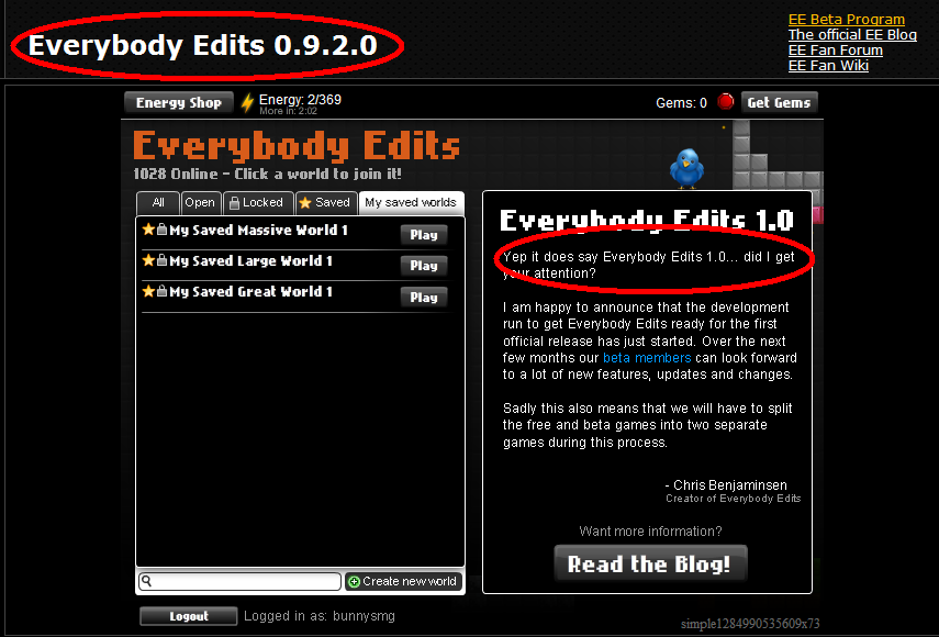
http://i37.photobucket.com/albums/e89/b … ORLY-1.png
Does it now? No, it does not.
... Its not the 1.0 versoin, RPGMaster2000 have sid it a thousand times now...
#42 Before February 2015
- Lin Keui Swampert
- Guest
Re: The new EE is ugly.
I think you're ugly. [/childishcomeback]
But no, I like this. This is good enough for a placeholder while they're fixing things, such as finding a replacement for the parental controls so it doesn't require you to pay money (I know it's 1 cent, but if you don't have a credit card you can't pay it, so I don't even want to hear someone like Shy Guy Bros. saying that unless they want to pay for mine themselves).
That (and the Kong problem) is the only thing I find unfair about this game at the moment.
#43 Before February 2015
- Jojatekok
- Guest
Re: The new EE is ugly.
JadElClemens wrote:Yeah, I really don't like the new layout. For the same reasons, too. Will the latest blog post widget stay there?
Right now, nothing about the layout is really set in stone since we're trying to gauge your reactions and ask for constructive criticism.
The best way to avoid haters is to add an options menu where you should select the skin you want.
BTW I personally LIKE the new lobby layout.
#44 Before February 2015
- BunnySMG
- Guest
Re: The new EE is ugly.
Oh, ok. I thought that's where you entered your new world's name.
#45 Before February 2015
- Chimi
- Guest
Re: The new EE is ugly.
All we really need as for tabs is My Saved Worlds, Open, and Locked. Saved or not can be determined by simply using a star. Or there could be a little check box likadis.
[ ] Check/Uncheck all
[ ] Open
[ ] Locked
[ ] Saved
[ ] My Saved

#47 Before February 2015
- CookiezEater
- Guest
Re: The new EE is ugly.
I like new lobby!
[ Started around 1714336496.9872 - Generated in 0.062 seconds, 11 queries executed - Memory usage: 1.57 MiB (Peak: 1.76 MiB) ]