Official Everybody Edits Forums
Do you think I could just leave this part blank and it'd be okay? We're just going to replace the whole thing with a header image anyway, right?
You are not logged in.
- Topics: Active | Unanswered
#1 Before February 2015
- SmittyW
- Member

- Joined: 2015-03-13
- Posts: 2,085

The new EE is ugly.
As I said on top. I dislike the format greatly and the Lobby is messed up. Anybody who agrees or disagrees, post below.
The reason I liked it 3.5237841900087693759384932716361115264382 times better was because everything was right in front of you. There was no need for extra folder layout + the blog to be there since most people go to the Blog post page anyway. -.-
LIKE NEW LAYOUT: 8 DISLIKE/TAKE SOME GETTING USE TO: 11
Last edited by SmittyW. (Apr 10 2011 7:26:05 pm)
Offline
#2 Before February 2015
- Jojomanjo
- Guest
Re: The new EE is ugly.
I know it is.
It'll take some getting used too.
#3 Before February 2015
- Calicara
- Guest
Re: The new EE is ugly.
You think? I think it's great. I like the organization of it. I think it's modernized and has good style...
#4 Before February 2015
- SmittyW
- Member
- Joined: 2015-03-13
- Posts: 2,085
Re: The new EE is ugly.
The reason I liked it 3.5237841900087693759384932716361115264382 times better was because everything was right in front of you. There was no need for extra folder layout + the blog to be there since most people go to the Blog post page anyway. -.-
Offline
#5 Before February 2015
- Twipply
- Guest
Re: The new EE is ugly.
As I said on top. I dislike the format greatly and the Lobby is messed up. Anybody who agrees or concurs, post below.
Having just said that last sentence, this thread can become nothing but people agreeing with you. That's not much of a discussion, is it? I think it's alright, but certainly not great and probably not as good as the previous one.
#6 Before February 2015
- Calicara
- Guest
Re: The new EE is ugly.
I think the main problem is just that it doesn't fit the theme of the game. It's not that it's neccesarily horrible, it's just not right for this game.
#7 Before February 2015
- SmittyW
- Member
- Joined: 2015-03-13
- Posts: 2,085
Re: The new EE is ugly.
fixed it, sorry. ![]()
Offline
#8 Before February 2015
- Jojomanjo
- Guest
Re: The new EE is ugly.
Wow. Already found a problem when you click energy you can see the tweet bird.
#9 Before February 2015
- Different55
- Forum Admin

- Joined: 2015-02-07
- Posts: 16,574

Re: The new EE is ugly.
Put it in bug reports. I don't really like it either.... I wonder if Chris is going to come on the forums to check first responses ![]()
"Sometimes failing a leap of faith is better than inching forward"
- ShinsukeIto
Offline
#10 Before February 2015
- RPGMaster2000
- Guest
Re: The new EE is ugly.
Put it in bug reports. I don't really like it either.... I wonder if Chris is going to come on the forums to check first responses
He doesn't really have to since that's pretty much become my job. ![]()
I'll see what I can do to improve the layout since the whole thing was pretty much his creation (aside from the tabbed browsing) based on your feedback. Bugs such as the twitter bird are things that he's already aware of so there's no need to report it here.
So what should we do to improve it? ![]()
#11 Before February 2015
- Jojomanjo
- Guest
Re: The new EE is ugly.
Make it so I can play beta here and kongregate. Not just kongregate only.
#12 Before February 2015
- musuki
- Guest
Re: The new EE is ugly.
It's quite good actually. Makes it easier looking for rooms.
#13 Before February 2015
- 0176
- Member

- From: Brazil
- Joined: 2021-09-05
- Posts: 3,174

Re: The new EE is ugly.
The blog box is too big... 
Offline
#14 Before February 2015
- Rhythm
- Guest
Re: The new EE is ugly.
I like it. I agree with musuki.
#15 Before February 2015
- Different55
- Forum Admin
- Joined: 2015-02-07
- Posts: 16,574
Re: The new EE is ugly.
Um... lets see...... it's just erm... (:P) different. Takes some getting used to. Or a lot. Completely different layout mean you have to find everything again.
"Sometimes failing a leap of faith is better than inching forward"
- ShinsukeIto
Offline
#16 Before February 2015
- 0176
- Member
- From: Brazil
- Joined: 2021-09-05
- Posts: 3,174
Re: The new EE is ugly.
Also, if beta and free are going to be separated again, does it mean that the Easter contest will be beta-only?
Offline
#17 Before February 2015
- Echo!
- Guest
Re: The new EE is ugly.
I honestly think its cute <3.. Is that strange?
#18 Before February 2015
- RPGMaster2000
- Guest
Re: The new EE is ugly.
Also, if beta and free are going to be separated again, does it mean that the Easter contest will be beta-only?
No, the splitting will happen after the level submission date has passed.
#19 Before February 2015
- correiajoao
- Guest
Re: The new EE is ugly.
I think that if the letter you a little longer, it would be great!
#20 Before February 2015
- JadElClemens
- Member
- From: Colorado, USA
- Joined: 2015-02-15
- Posts: 4,559
Re: The new EE is ugly.
Yeah, I really don't like the new layout. For the same reasons, too. Will the latest blog post widget stay there?

I hate tall signatures.
Offline
#21 Before February 2015
- RPGMaster2000
- Guest
Re: The new EE is ugly.
Yeah, I really don't like the new layout. For the same reasons, too. Will the latest blog post widget stay there?
Right now, nothing about the layout is really set in stone since we're trying to gauge your reactions and ask for constructive criticism.
#22 Before February 2015
- Mel Mel
- Guest
Re: The new EE is ugly.
It's okay. I guess I could get used to it. :/
#23 Before February 2015
- Tonyantonio
- Guest
Re: The new EE is ugly.
There is also a promblem with the locks they look poorly drawn...
#24 Before February 2015
- BunnySMG
- Guest
Re: The new EE is ugly.
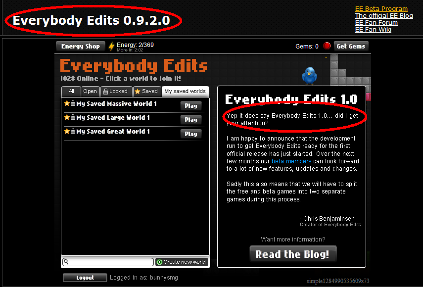
Does it now? No, it does not.
#25 Before February 2015
- Mel Mel
- Guest
Re: The new EE is ugly.
He meant at the top of the Blog notice. -_-
[ Started around 1714362584.579 - Generated in 0.040 seconds, 10 queries executed - Memory usage: 1.56 MiB (Peak: 1.73 MiB) ]