Official Everybody Edits Forums
Do you think I could just leave this part blank and it'd be okay? We're just going to replace the whole thing with a header image anyway, right?
You are not logged in.
- Topics: Active | Unanswered
Pages: 1
#1 2015-06-15 19:15:59, last edited by AmdS (2015-06-15 19:17:22)
#2 2015-06-15 19:16:59
- Anch
- Member
- Joined: 2015-02-16
- Posts: 5,447
Re: Crown and Diamond block idea.
It looks pretty good!
Offline
- Wooted by:
#3 2015-06-15 19:24:07
- Pingohits
- Banned

- From: aids lizard
- Joined: 2015-02-15
- Posts: 7,591
Re: Crown and Diamond block idea.
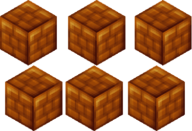
i don't like the crown re-texture, but the new blocks looks pretty cool
maybe it should be called "glazed glass block"

Offline
- Wooted by: (7)
#4 2015-06-15 19:30:01, last edited by AmdS (2015-06-15 19:31:27)
Re: Crown and Diamond block idea.
i don't like the crown re-texture, but the new blocks looks pretty cool
maybe it should be called "glazed glass block"
Anch159 wrote:
It looks pretty good!
I think mods can do it better about the crowns. And ok, the name seems nice. Thanks!
Offline
- Wooted by:
#5 2015-06-15 19:34:41
- Creature
- Member

- From: The Dark Web
- Joined: 2015-02-15
- Posts: 9,658
Re: Crown and Diamond block idea.
Where are the diamonds?
This is a false statement.
Offline
#7 2015-06-15 19:39:40
- Creature
- Member

- From: The Dark Web
- Joined: 2015-02-15
- Posts: 9,658
Re: Crown and Diamond block idea.
Creature wrote:Where are the diamonds?
HabboGame called it diamonds blocks. I don't know how this can be called.
"blue glazed glass block"
This is a false statement.
Offline
#8 2015-06-15 21:17:09
- Xfrogman43
- Member

- From: need to find a new home
- Joined: 2015-02-15
- Posts: 4,174
Re: Crown and Diamond block idea.
Gabriel wrote:Creature wrote:Where are the diamonds?
HabboGame called it diamonds blocks. I don't know how this can be called.
Pingohits wrote:"blue glazed glass block"
He didn't say blue glazed glass block...
 thanks zoey aaaaaaaaaaaand thanks latif for the avatar
Offline
- Wooted by:
#9 2015-06-16 01:10:13
- Anch
- Member

- Joined: 2015-02-16
- Posts: 5,447
Re: Crown and Diamond block idea.
The crown's color looks too 'sharp'.
Offline
#10 2015-06-16 01:27:37
- Kirby
- Member

- Joined: 2015-04-04
- Posts: 4,307
Re: Crown and Diamond block idea.
I think the crown is fine as it is, right now it looks gold, this makes it look a bit too yellow. The block looks good, but i would make the border a bit darker. Once you do, that would look very good
Offline
- Wooted by:
#11 2015-06-16 20:59:32
- skullz17
- Member
- Joined: 2015-02-15
- Posts: 6,699
Re: Crown and Diamond block idea.
I think all blocks that have shading like that should, like kirby said, have a dark border. At the moment they don't look that good together imo.

thx for sig bobithan
Offline
- Wooted by:
Pages: 1
[ Started around 1732330182.5431 - Generated in 0.065 seconds, 10 queries executed - Memory usage: 1.52 MiB (Peak: 1.67 MiB) ]
