Official Everybody Edits Forums
Do you think I could just leave this part blank and it'd be okay? We're just going to replace the whole thing with a header image anyway, right?
You are not logged in.
- Topics: Active | Unanswered
#1 Before February 2015
- Alexthementalone
- Banned
Alex's EE Title Designs!
Here are some designs for Everybody Edits, this does not pertain in creative because it relates to EE, which is obviously not off-topic.
---------------------------------------------------------------------------------------------------------------
Alex's EE Title Designs!
---------------------------------------------------------------------------------------------------------------
Normal Screen

Normal Screen (2)

Halloween Screen

Summer Screen

Easter Screen

---------------------------------------------------------------------------------------------------------------
BONUS
Here are some extra's that I just thought would be interesting to make...
/Alex
Last edited by Alexthementalone (Jul 8 2014 9:48:51 am)
#2 Before February 2015
- 222hockey222
- Guest
Re: Alex's EE Title Designs!
Nice job on the title screen, but I don't see how it relates to halloween. Two zombies is all I see.
#3 Before February 2015
- Haze123
- Member

- Joined: 2015-03-09
- Posts: 1,691
Re: Alex's EE Title Designs!
Nice job on the title screen, but I don't see how it relates to halloween. Two zombies is all I see.
Eh? It's normal screen, isn't it? Halloween is in devolopment. Correct me if im wrong.
 I are back.
Offline
#4 Before February 2015
- Arceus64
- Guest
Re: Alex's EE Title Designs!
There are plenty of EE-related topics in Creative. I think posting there would make more sense (though it would take away from the extra views you desire).
#5 Before February 2015
- Creature
- Member
- From: The Dark Web
- Joined: 2015-02-15
- Posts: 9,658
Re: Alex's EE Title Designs!
I am open to feedback and suggestions, thanks for reading!
A summer themed title.
This is a false statement.
Offline
#6 Before February 2015
- Alexthementalone
- Banned
Re: Alex's EE Title Designs!
Before I acknowledge posts, thanks for the input guys, I appreciate it and will act upon any criticisms. ![]()
222hockey222 wrote:Nice job on the title screen, but I don't see how it relates to halloween. Two zombies is all I see.
Eh? It's normal screen, isn't it? Halloween is in devolopment. Correct me if im wrong.
The 'Normal Screen' is just an average screen, halloween is in development.
There are plenty of EE-related topics in Creative. I think posting there would make more sense (though it would take away from the extra views you desire).
Well since the forum has a heading of 'off topic' and creative is situated in there, it wouldn't make sense to put it there as this topic relates to EE.
Also since EE has had predecessor seasonal-themed updates one after another previously, I thought it would be fun to create some new ones. I may forward these screens to Brian, since the title screen hasn't changed for a year. If anyone else would like to contribute towards new title screens then I would include them in this topic, and perhaps send them off to Brian as stated above.
Alexthementalone wrote:I am open to feedback and suggestions, thanks for reading!
A summer themed title
I was actually thinking of a summered themed one also, I will include a suggestion box soon! ![]()
/Alex
Last edited by Alexthementalone (Jul 5 2014 4:48:52 pm)
#7 Before February 2015
- Tachyonic
- Guest
Re: Alex's EE Title Designs!

bad minigame making
#8 Before February 2015
- Alexthementalone
- Banned
Re: Alex's EE Title Designs!
bad minigame making
Haha just wanted to have a bit of simplicity instead of a challenging mini... ![]()
They do kind of 'set the scene' a little bit too.
/Alex
Last edited by Alexthementalone (Jul 5 2014 5:20:51 pm)
#9 Before February 2015
- Anch
- Member

- Joined: 2015-02-16
- Posts: 5,447
Re: Alex's EE Title Designs!
The first one isn't a very good example of what EE looks like.
Offline
#10 Before February 2015
- Alexthementalone
- Banned
Re: Alex's EE Title Designs!
The first one isn't a very good example of what EE looks like.
I tried to give a flavourful lol. ![]()
Also updated with 'halloween title screen'
/Alex
#11 Before February 2015
- 222hockey222
- Guest
Re: Alex's EE Title Designs!
My bad. I usually read the title below pictures, didn't even notice that it was in development.
#12 Before February 2015
- Anch
- Member

- Joined: 2015-02-16
- Posts: 5,447
Re: Alex's EE Title Designs!
Again, some more criticism:
In the Halloween version, the font doesn't match EE very well.
Offline
#13 Before February 2015
- dragonranger
- Member
- Joined: 2015-03-21
- Posts: 1,162
Re: Alex's EE Title Designs!
The fact only your name is in it is a bit weird, I think you should remove that, as the main home screen doesn't have any names in it, which doesn't make it feel that one person owns it all (even though they might, it attracts more players).
A bit more diversity would be nice. The current homescreen is extra diverse, with so many blocks and smileys, and actions (magic coin, rank up e.t.c), whereas yours only use 5-6 packs in the first, most of which, hardly blend in like the current one. Also, more backgrounds. Yours both only use 2, whereas the current, "a lot".
Also, as anch said, the font for the halloween is a bit. Out of place. Everybody edits is more of a blocky feel, than a halloween feel. Maybe, a scary blocky font would work, but definitely not what looks like thriller, the most overused "scary" font ever.... I would prefer an in-game sign, or just use the already existing title and copy paste it in, theyve had that in every single homescreen havent they? Although the fact of CHANGING up the title screen could have a couple of changes, it shouldn't be too much, like a whole new unofficial logo e.t.c.
Anyway, I like the idea of this thread, and I myself am currently trying to make one, but your executions so far haven't been up to standard of the already existing designs, which would defeat the point of "my guess" of your aim; to have the Title Design improved.
[strike]Will edit with my designs when and if I make them (probably not, or else only 1, which might take awhile, as I am simply editing in smileys blocks e.t.c into a blank canvas)[/strike] Nvm, my computer is wayyy too laggy to even play EE, nevertheless edit a picture with the in-game blocks.
Rant Done!
P.S: Homescreen= Titlescreen, can't be bothered editing it
P.P.S: This might be useful, the already existing homescreen, as a sort of "guideline" 
Also, note: the size is 639x469 pixels (this is probs a pixel or 2 off), which is about 37.5x27.5 blocks
Last edited by Dragonranger (Jul 5 2014 9:05:14 pm)
Offline
#14 Before February 2015
- Alexthementalone
- Banned
Re: Alex's EE Title Designs!
Ok thanks for the input, I'm currently making a summer themed title, so stay tuned! ![]()
EDIT: Here it is:

/Alex
Last edited by Alexthementalone (Jul 6 2014 4:38:40 am)
#15 Before February 2015
- dragonranger
- Member
- Joined: 2015-03-21
- Posts: 1,162
Re: Alex's EE Title Designs!
Definitely improved, less ranks? That really just clusters it up.
More backgrounds
Whys the poumpkin say sunscream.
More blocks, more decorations. Spikes e.t.c might help, you want good in-game art with features of the game. Easy ones to include: people using potions (i see you have one, but more?) them shiny e.t.c
In my opinion chat isn't... fitting in, though thats imo
Mainly i would suggest making it express the whole of ee, the fun of potions, the rage of death e.t.c, with the smiley you think matches it. Then, try to focus on adding every pack, space pack? Spaceship with an astronaut smiley e.t.c. But include it all, even if it just is a summer theme, you should spruce it up a bit
Sorry i am sounding hypocritical as my excuse for not making one was "im too laggy", i simply like to criticize, as helpful as i can be (you would be able to see on other forums...)
So yeah, my view of the new one. Imroved, but imo, still not up to already existing standards
Edit: sorry about spelling mistakes, im tired and i am on mobile,
Last edited by Dragonranger (Jul 6 2014 6:35:31 am)
Offline
#16 Before February 2015
- Alexthementalone
- Banned
Re: Alex's EE Title Designs!
Mainly i would suggest making it express the whole of ee.
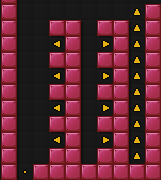
But seriously, thanks for the constructive criticism. I may do another 'normal' screen. ![]()
/Alex
#17 Before February 2015
- Anch
- Member

- Joined: 2015-02-16
- Posts: 5,447
Re: Alex's EE Title Designs!
The summer one is pretty good. Someone wooting, someone leveling up, people talking and jumping and in the water blocks.
Offline
#18 Before February 2015
- skullz17
- Member
- Joined: 2015-02-15
- Posts: 6,699
Re: Alex's EE Title Designs!
Yeah but the one-way blocks are incorrect. They go in front of the smiley. Also smileys in the water need to look different. Fire potion doesn't look right, but not sure about this one. Most of the chat bubbles seem edited in badly. And finally, please please please get rid of the names. Not necessary.

thx for sig bobithan
Offline
#19 Before February 2015
- Anch
- Member

- Joined: 2015-02-16
- Posts: 5,447
Re: Alex's EE Title Designs!
Oh yeah that's true. All of them is just pasted onto an image. You could put them on different layers.
Offline
#20 Before February 2015
- Alexthementalone
- Banned
Re: Alex's EE Title Designs!
Updated. ![]()
Normal Screen (2)

Points to consider:
~ The editing site I used did not allow me to set the smilies behind the water.
~ The file I used to transfer the smilies onto the image did not contain a death by spikes animation.
~ This work involves alot of correct positioning and tedious work, please comment usefully.
~ Text is a little bland, however there was no room availiable
/Alex
#21 Before February 2015
- Creature
- Member

- From: The Dark Web
- Joined: 2015-02-15
- Posts: 9,658
Re: Alex's EE Title Designs!
The editing site I used
I wanted to know what site you using.
This is a false statement.
Offline
#22 Before February 2015
- Anch
- Member

- Joined: 2015-02-16
- Posts: 5,447
Re: Alex's EE Title Designs!
For normal screen 2, you could put EVERYBODY and EDITS with the underground temple thing in the middle.
Offline
#23 Before February 2015
- Alexthementalone
- Banned
Re: Alex's EE Title Designs!
Alexthementalone wrote:The editing site I used
I wanted to know what site you using.
Have you lost your manners? ![]()
For normal screen 2, you could put EVERYBODY and EDITS with the underground temple thing in the middle.
Sorry, I cannot do that request as the layers have mixed, therefore I cannot edit individual ones. The editing program I am using (haha Creature) does not allow.
/Alex
Last edited by Alexthementalone (Jul 7 2014 1:44:46 pm)
#24 Before February 2015
- Creature
- Member

- From: The Dark Web
- Joined: 2015-02-15
- Posts: 9,658
Re: Alex's EE Title Designs!
Creature wrote:Alexthementalone wrote:The editing site I used
I wanted to know what site you using.
Have you lost your manners?
What do you mean?
This is a false statement.
Offline
#25 Before February 2015
- Alexthementalone
- Banned
Re: Alex's EE Title Designs!
Alexthementalone wrote:Creature wrote:I wanted to know what site you using.
Have you lost your manners?
What do you mean?
It means you are very direct lol.
I am using the editor here.
/Alex
[ Started around 1731900346.7411 - Generated in 0.057 seconds, 13 queries executed - Memory usage: 1.77 MiB (Peak: 2.02 MiB) ]

